Storyboard
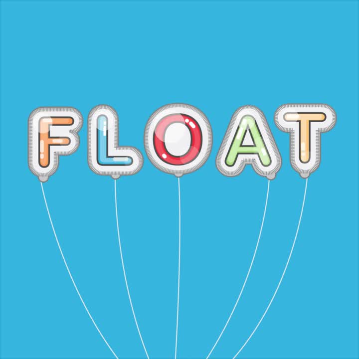
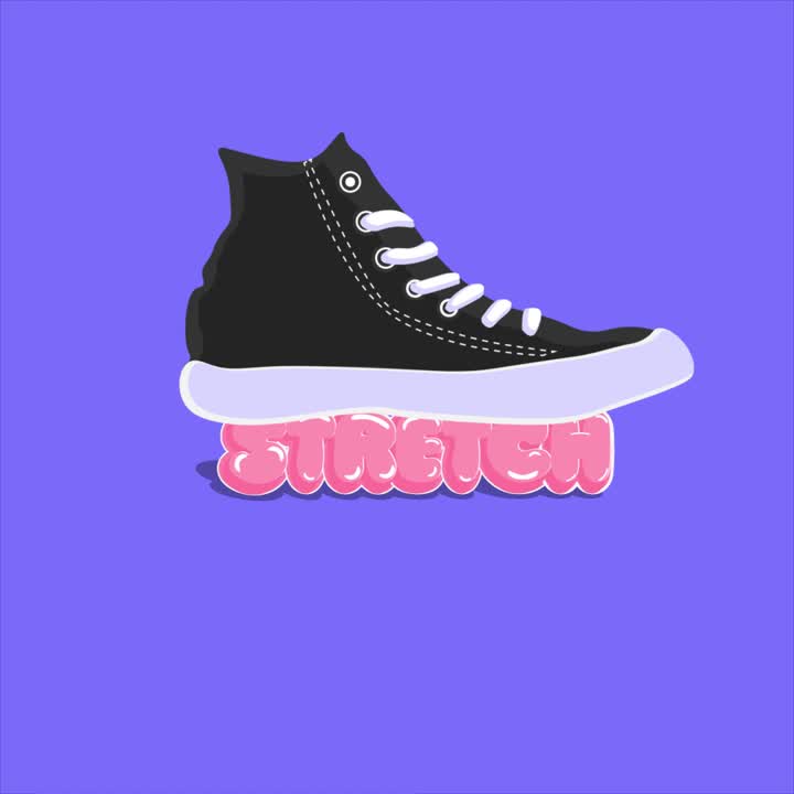
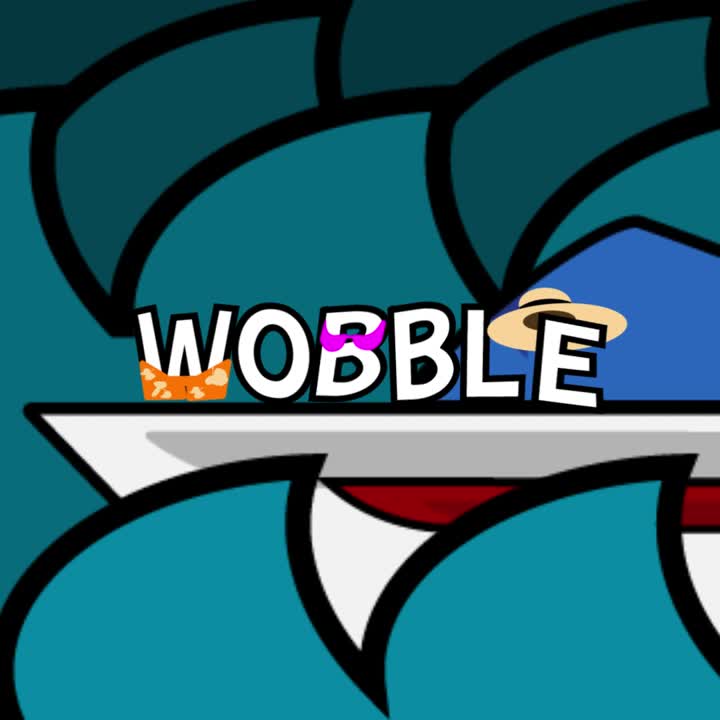
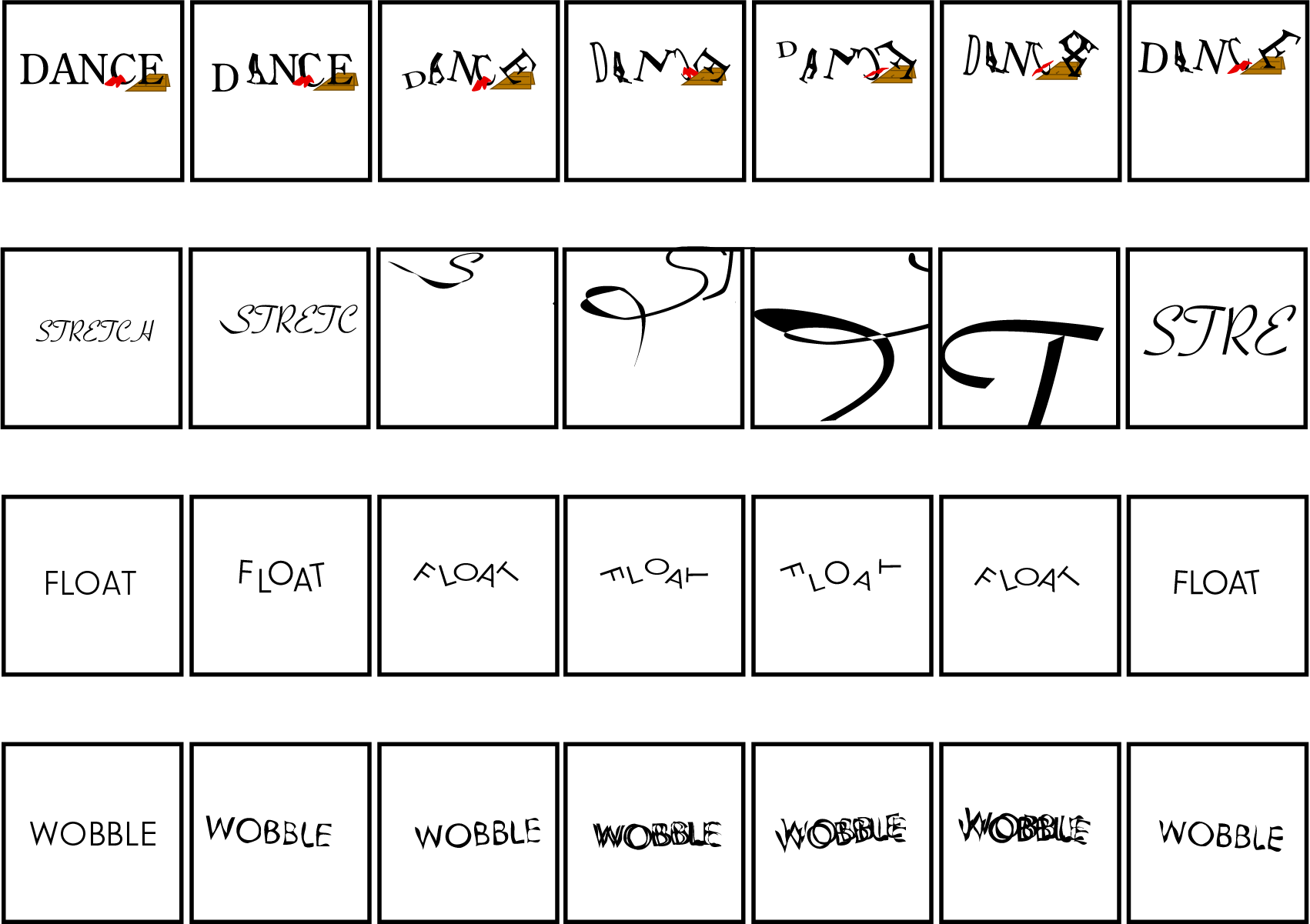
Before animating, I created storyboards that mapped out how each verb would be expressed through movement. For “stretch,” I zoomed in on the letterform to emphasize distortion and elongation. By experimenting with typeface selection, stroke weight, and proportion, I explored how the form could visually communicate the sensation of being pulled apart. For “float,” I thought about how slow and gentle the letters would pull away on water before finalizing it as balloons rather than items on water. For “wobble,” I explored form distortion and typographic weight by varying the stroke thickness and surface alignment of the letterforms. I exaggerated the instability by placing the word against a baseline plane, allowing the forms to visually resist balance. I even explored additional ideas, such as “dance,” where I considered rhythmic movement of letters as if choreographed each letter to different types of music. While I decided not to animate that one, the storyboard reflects how I think through multiple possibilities before committing to a direction.This process helped me connect visual metaphors to word meanings, plan transitions and timing, and ensure the concept worked visually before going into After Effects.