Table of Contents
↑ Back to Top1. Overview2. Problem & Goal3. Process4. Solution5. Impact

La Casita Mercado

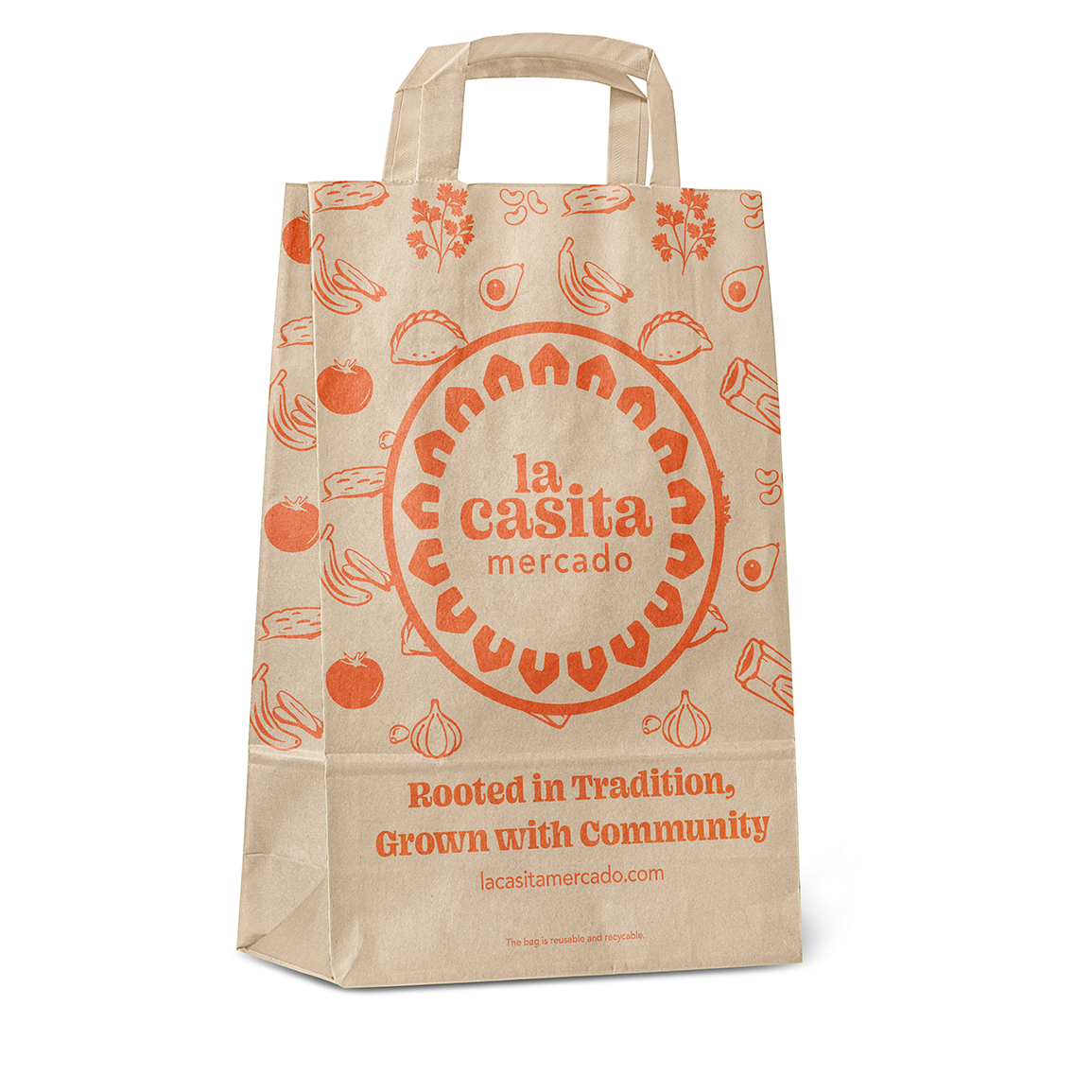
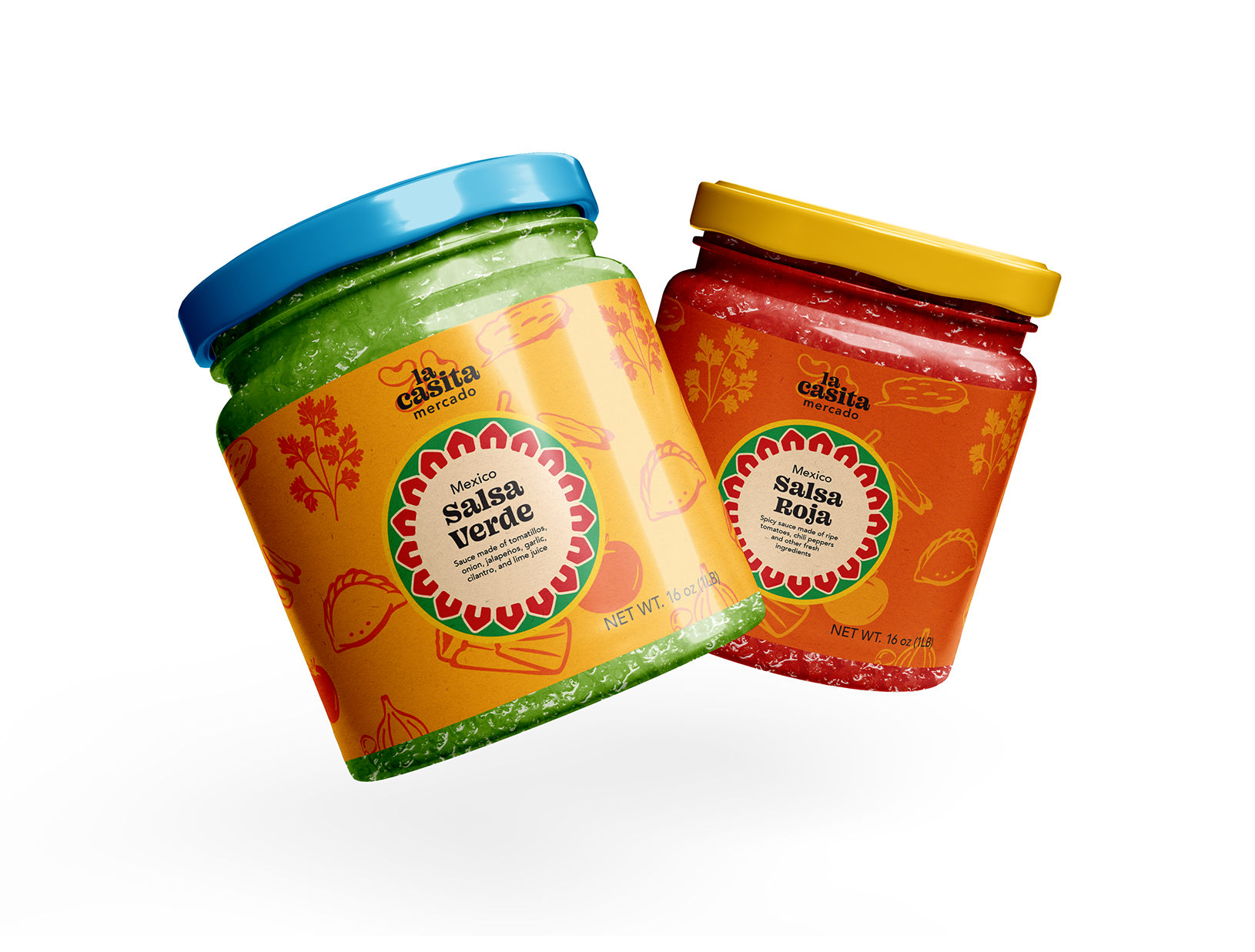
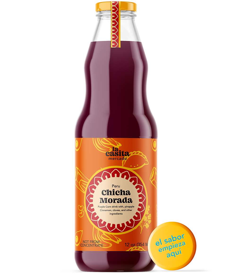
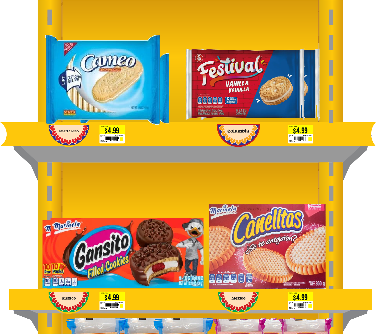
Branding |  Bilingual Design | Advertising Design | Signage
A culturally rooted grocery brand inspired by Latin American flavors, traditions, and community. Built around the symbol of a casita (little house), the identity brings warmth, clarity, and bilingual design to signage, packaging, and in-store experiences.
Problem
Latino grocery stores are cultural hubs, but their branding is often generic, inconsistent, and rarely bilingual. This disconnect leaves communities underserved and underrepresented.

Goal
Create a cohesive identity that feels like home, celebrating tradition, improving clarity, and making every shopping experience welcoming and familiar.

Process

  • Researched mercados and mainstream grocery branding to identify gaps in cultural representation.
  • Chose the casita (little house) as the central symbol of warmth, tradition, and belonging.
  • Built a flexible system: logo, patterns, packaging, signage, and in-store experience.
Brand Identity System

Solution

Identity

Packaging

Environment

Impact

La Casita Mercado reimagines the grocery store as more than a place to shop, it becomes a cultural hub. The brand system builds pride, accessibility, and a sense of home for the community.